
Carbon Signal delivers sophisticated analytical capabilities designed for professionals with building science expertise. While anyone can use Carbon Signal, users with a strong foundation in energy modeling concepts will get the most out of the platform’s powerful features. Carbon Signal’s hybrid approach - combining physics-based modeling with advanced statistical techniques - provides unique insights that sometimes require thoughtful interpretation. Having a nuanced understanding of the modeling approach will help users make informed decisions about decarbonization and translate analytical outputs into strategic implementation plans.
Model Calibration
One of the core concepts in Carbon Signal is the idea of model calibration - tuning the energy model to accurately represent the baseline building conditions. Traditionally, calibration is done through a manual guess-and-check process whereby an energy modeler will continually tweak model inputs until the modeled energy use lines up with measured utility data. Professional organizations like the American Society of Heating, Refrigeration, and Air-conditioning Engineers (ASHRAE) dictate the standards and metrics used to measure the quality of the calibration.
The calibration process on Carbon Signal is fully automated. We still rely on widely accepted metrics for measuring the quality of the calibration, but we’ve replaced the manual guessing and checking with a suite of statistical methods that allow us to quickly find the right combination of model inputs that best explain the measured utility data, given a building’s size and location.
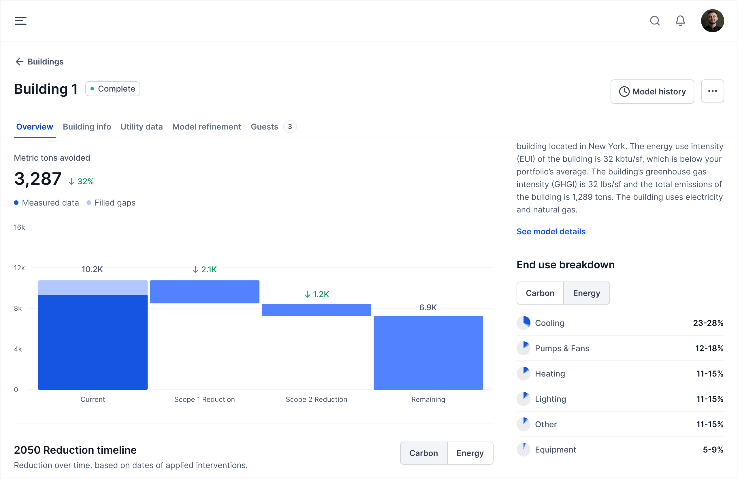
There are three main places you can review to assess the quality of the calibration: the energy end use disaggregation, the modeled utility data, and the model characterization.
End Use Disaggregation
The end use disaggregation is shown on the building details page. It shows the breakdown of energy use (and carbon emissions) by major end use such as heating, cooling, and lighting. The ranges represent the extent of the model data. Looking at the end use data is a good place to start when reviewing the model, especially if you have any preexisting knowledge of whether the building is dominated by heating, cooling, or another end use.
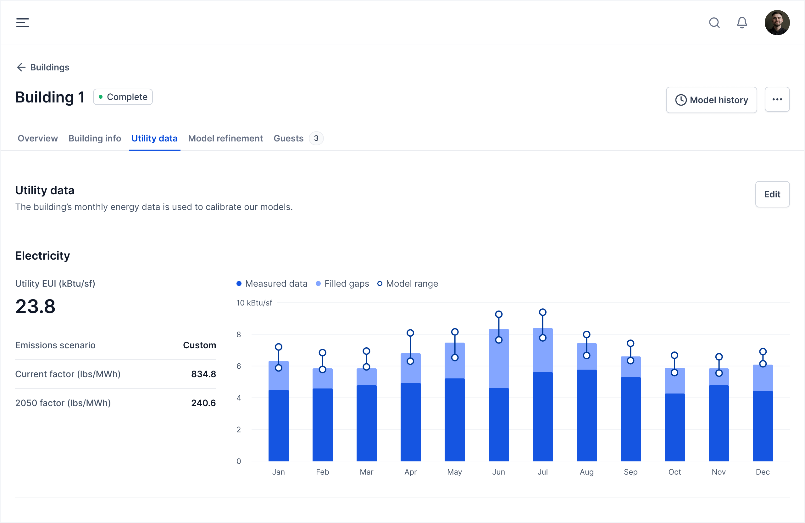
Modeled Utility Data
The Utility data tab displays monthly energy profiles for each utility, highlighting data adjustments and modeled energy use ranges. Adjustments indicate areas where the measured data falls significantly below the predictive range of our models, which typically signals missing data, reporting errors, or atypical building usage patterns.
The proximity of the model range to the measured utility data directly correlates to the quality of the model calibration. When measured data falls within the model range, calibration is strong; when it falls outside, calibration requires improvement.
Model Characterization
Clicking on See model details from the Overview tab will open a window that displays the model performance characterization chart. This chart shows some of the input parameters that we include in the energy model, such as wall assembly R value, lighting power density, and system coefficient of performance. For each input parameter, we show the range of values that we test, the range of values that are carried in the model, and the estimated value, which corresponds to the mean value in the ensemble.
This chart can provide a ton of useful information if interpreted correctly. One point of confusion is that these parameters represent the actual design conditions of the building - the actual details of the building as specified during construction. The slightly better interpretation of these values is that they represent how the building is performing. For example, your building might have R15 insulation, but due to thermal bridging, infiltration, material degradation, and other factors, the thermal performance of the wall assembly is roughly equivalent to a building with R5 insulation, which is what might be indicated in the performance characterization chart.
Instances where there are large discrepancies between known conditions in the building and what the model is able to predict (as would be the case in the example above) indicate an opportunity for further investigation. This is particularly true for parameters with a relatively small model range, which generally indicates that the model is highly sensitive to that particularly input variable.
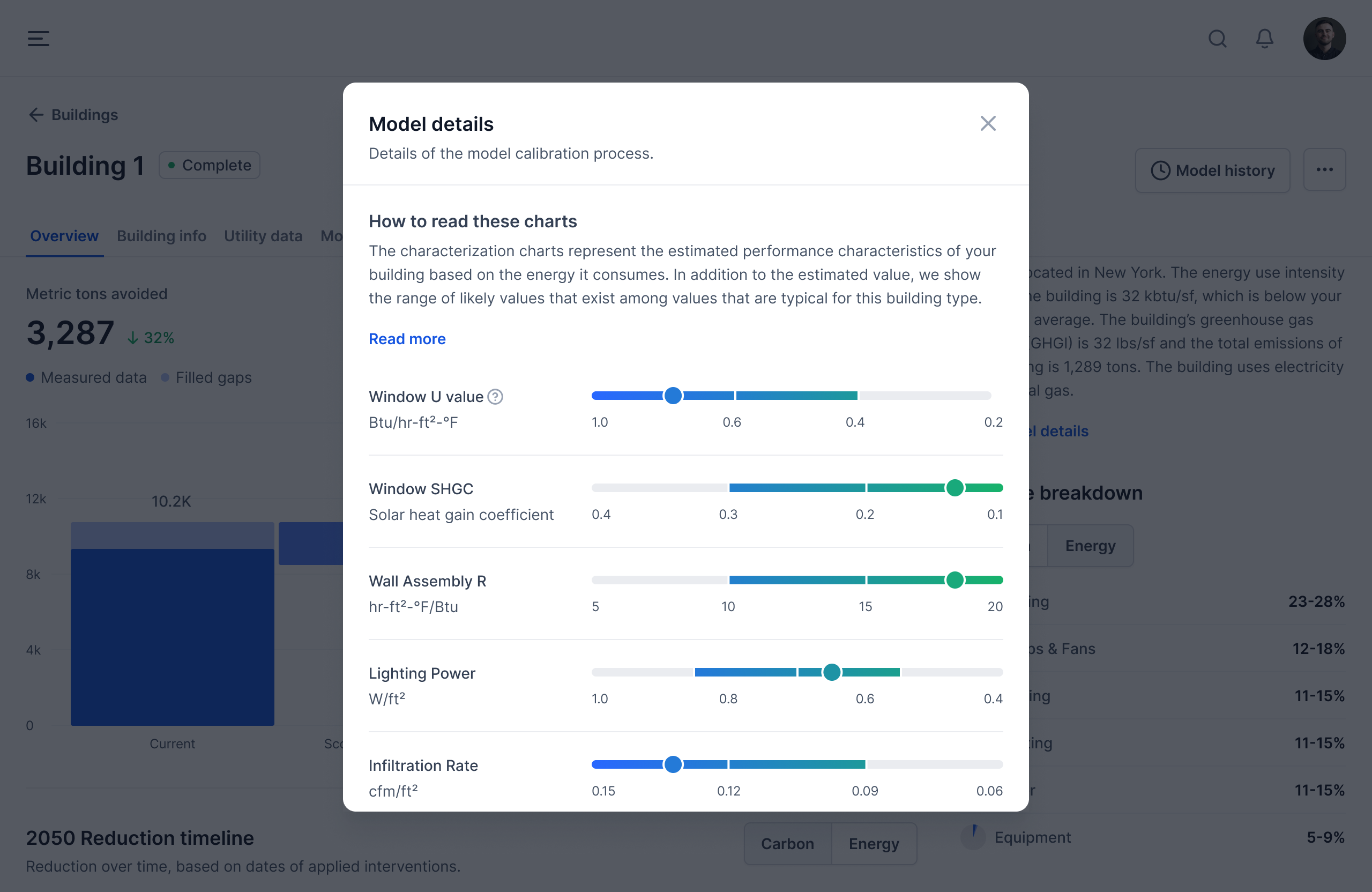
An even better interpretation of this data is that it simply represents the collection of parameters that is most likely to explain observed patterns of energy use. There are complex interactions that exist between some of the variables and having some level of building science knowledge can help you navigate these effects. For example, it’s difficult for the model to disaggregate certain types of electrical loads, such as lighting and equipment. Given a set level of electricity use, it’s challenging to predict whether that is due to a low lighting power density (LPD) and high equipment power density (EPD), or a low EPD and high LPD, or some combination in between. This is especially true when relying on monthly energy data and without any additional information about the building. Refining the model by answering simple questions about the building, such as whether there has been a recent lighting retrofit, can help disentangle certain end uses and more accurately predict underlying building performance values. For more information on this process of model refinement, see Editing Models.
Intervention Results
The intervention results are calculated using the baseline energy models and therefore are directly related to the model calibration details. When interpreting the intervention results, it’s helpful to refer back to the three pieces of information outlined above: the end-use disaggregation, the modeled utility data, and the model characterization. Here are some helpful questions that you can use to validate the results.
- Does the magnitude of savings for specific interventions correlate to the main drivers of energy use indicated in the end-use breakdown data? For example, if lighting energy is one of the largest end-uses, does that correlate to more energy and emissions savings from lighting upgrades, relative to other interventions?
- Are there particular parameters in the model that might result in higher energy use? If so, do the specific interventions that target these parameters yield significant savings? For example, we would expect that ventilation system upgrades would yield significant savings in a building with high ventilation rates.
- Do the intervention results make sense given the emissions factors for various fuels? For example, one would expect significant emissions savings from electrification for buildings where the electricity emissions factor is lower than that of natural gas.
For additional considerations, reach out to support@carbonsignal.com to schedule a call. We’re happy to review your data and help you interpret results.