
With larger portfolios, it becomes increasingly important to understand the buildings and interventions where the biggest opportunities for improvement lie. The Portfolio Overview feature helps to surface trends, benchmark performance, and prioritize decarbonization efforts at a larger scale. Whether you are managing regulatory risk, identifying underperforming buildings, or determining where to invest next, Portfolio Overview will provide insight to allow you to take action.
You can also use Advanced Filtering to focus your analysis on specific subsets of buildings, such as those in a particular region or those over a certain size.
How to Use Portfolio Overview
At the top of the Portfolio Overview, there are four summary cards that highlight key metrics across all buildings included in the current filter. These cards provide a quick snapshot of your portfolio’s performance.
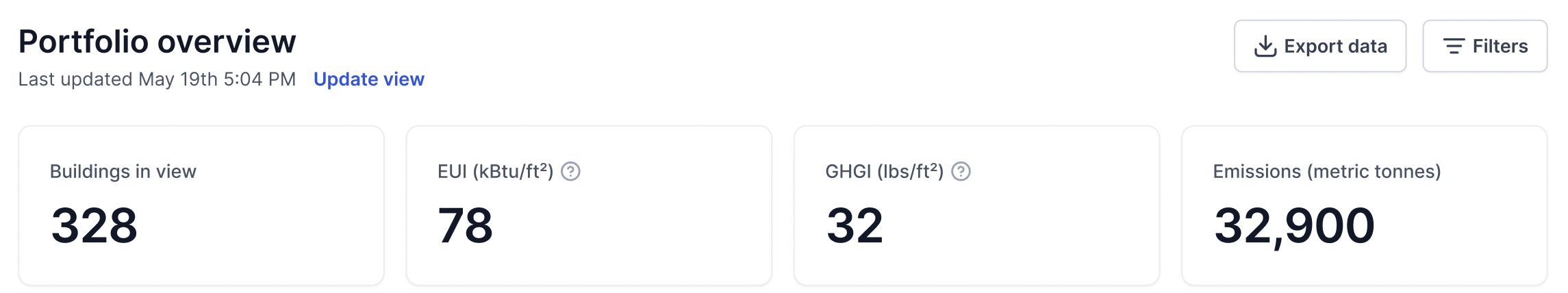
- Buildings in View: Total number of buildings captured by the applied filter. If no filter is used, it reflects all buildings in the portfolio.
- Energy Use Intensity (EUI): The EUI of the filtered building set (the total amount of energy divided by the total floor area).
- Greenhouse Gas Intensity (GHGI): The GHGI of the filtered building set (the total emissions divided by the total floor area)
- Emissions: The total emissions of the filtered building set.
These summary cards update dynamically as filters are applied.
Portfolio Overview currently consists of the following widgets: Building Performance and Top Interventions.
Building Performance
This widget allows you to visualize and compare buildings in your portfolio using key metrics. It can help identify high-intensity buildings that may require attention—for example, those at risk of exceeding regulatory thresholds.
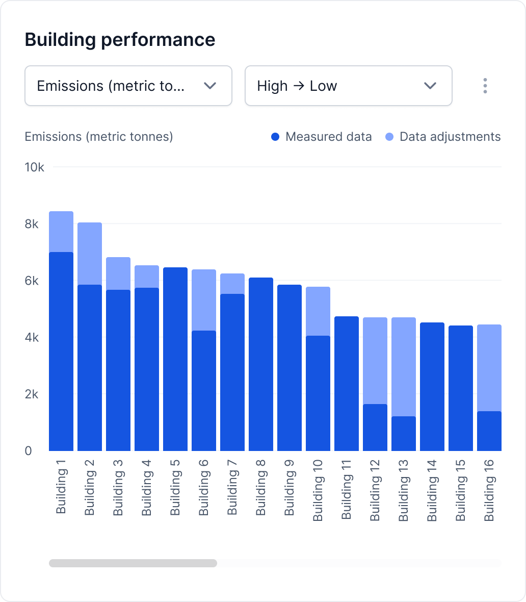
The horizontal axis displays all of the buildings in your current filter.
Use the first dropdown to choose the metric shown on the vertical axis. You can select from:
- Energy Use Intensity (EUI)
- Greenhouse Gas Intensity (GHGI)
- Total Emissions
- Total Energy Use
Use the second dropdown to change your sort order from High to Low or Low to High.
Top Interventions
This widget allows you to visualize and compare interventions in your portfolio using key metrics. It helps identify which interventions deliver the biggest impact or return on investment, supporting smarter planning and implementation.
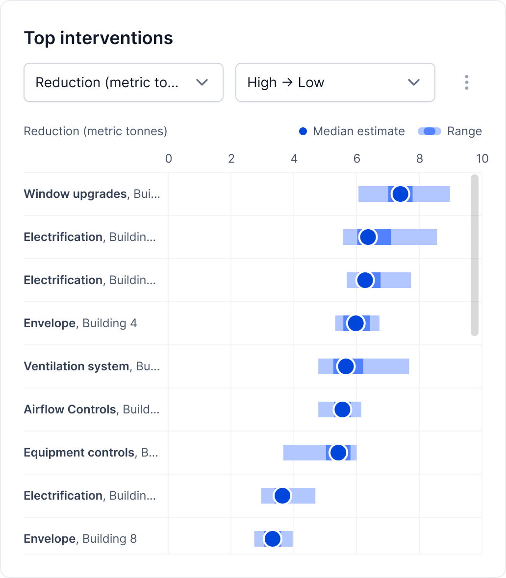
The vertical axis displays interventions modeled across your portfolio.
Use the first dropdown to choose the metric shown on the horizontal axis. You can select from:
- EUI Reduction
- GHGI Reduction
- Emissions Reduction
- Energy Reduction
- Emissions Reduction per Unit of Investment
- Energy Reduction per Unit of Investment
Use the second dropdown to change your sort order from High to Low or Low to High.